This week in class we talked about two different frameworks that will help us analyze educational technologies as teachers. The first tool for analyzing technologies that we discussed was SAMR (Substitution, Augmentation, Modification, and Redefinition). I believe this is a powerful tool to use because there have been times where I have seen technology used in the classroom and I wonder why? I don’t always see the benefit, especially when it is used just as substitution. For example, when teachers use someone on YouTube to read the students a book, when they could have just done it themselves. I think it is important to remember to use this model to check the technology before you implement it into your classroom. Another model we looked at was called SECTIONS (Students, Ease of use, Costs, Teaching functions, Interaction, Organizational issues, Networking, Security and Privacy). This model is another tool for evaluating technology used within the classroom. This model is similar to SAMR, except it is more in depth and I would use it more to check the technology after you have chosen it. Whereas I would use SAMR before I even chose the technology substitution. The other two tools we learned more about in class were sketchnoting and infographics.
Sketchnoting:
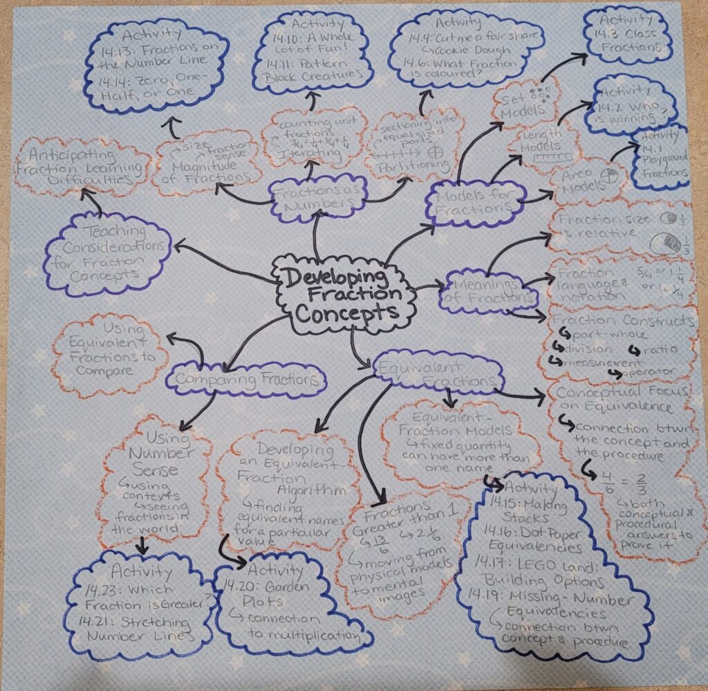
The sketchnote that I attached to this post is for Elementary Math Concepts: Fractions! I made it while I was reading the Math textbook chapter for my pedagogy of Mathematics course. I love sketchnotes/mind maps because I find the visuals help me to remember the information better. If I would have only read the chapter and not done the sketchnote then I would have remembered much less.
Infographic:
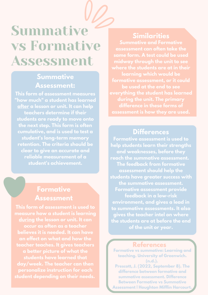
The infographic to the right is one that I made for our assessment class. The idea for this infographic was to make a handout that would teach parents the differences between summative and formative assessment in a way that was not overwhelming and pleasing to look at. I like making infographics, because similar to sketchnotes, I find that they help me remember the information better when I can look at it in a way that is aesthetically pleasing, and not just words on a paper. I wish all the papers we have to read for our classes were made into infographics!
22 February 2023 at 11:42 am
WOW, Kailee! Love your post. I found it very informative and easy to read. You nailed all the topics that were required of you from the rubric and I love how you laid it all out. I wonder if next post you could talk more about how you would use these tools that you do like in your classroom? For example, would you have your students make sketch-notes or would you make some for them?
Great job 🙂